
You May Also Enjoy
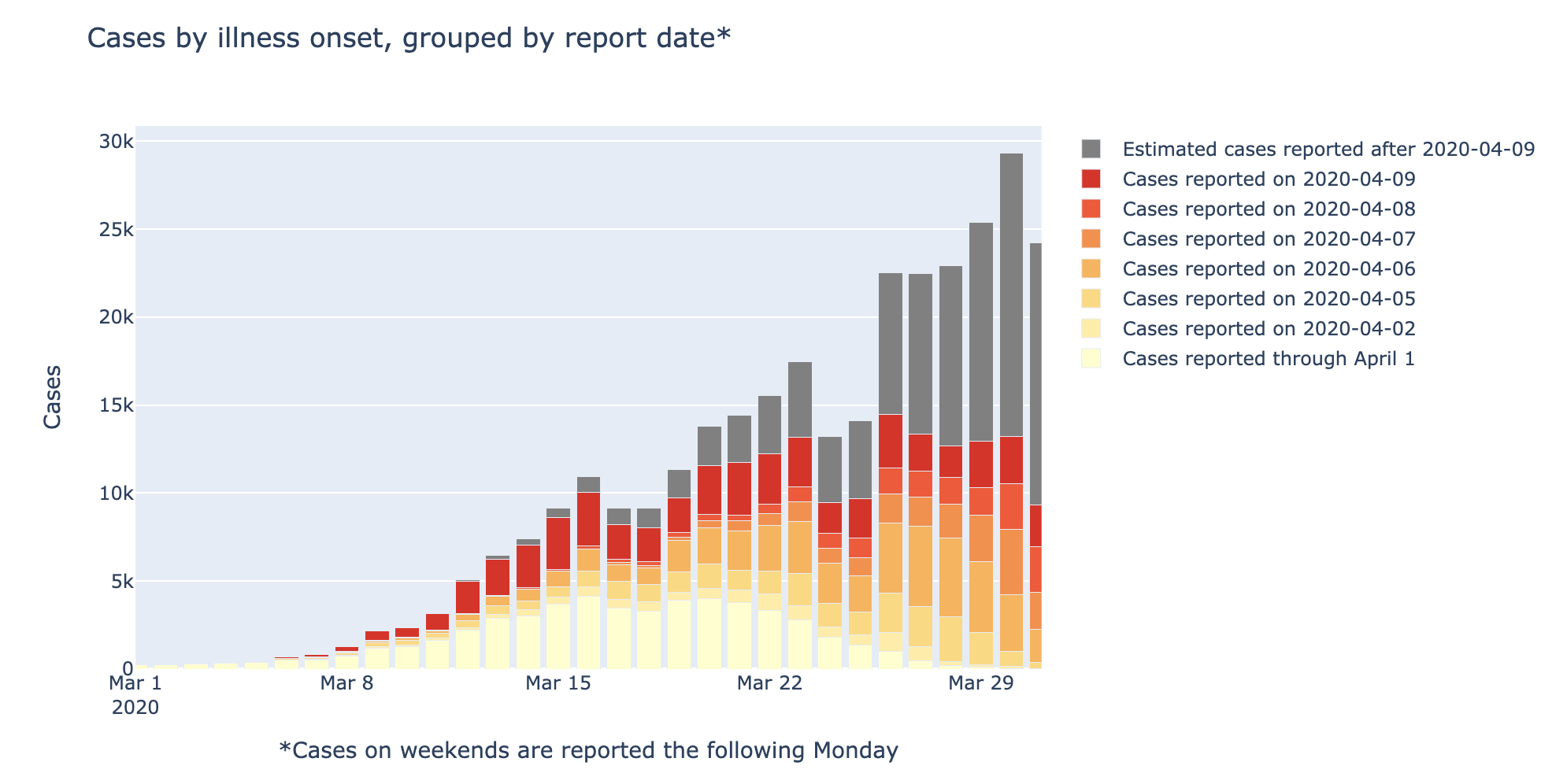
CDC COVID-19 case reporting delays
One of the challenges of modelling and responding to pandemics is real-time, reliable case data. Here, I quantify and visualize the magnitude of reporting de...
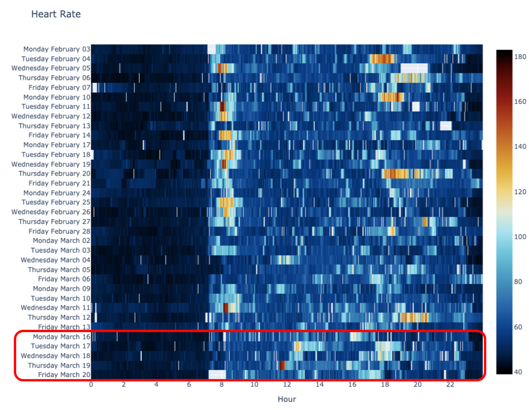
Fattening the Curve Permalink
Empirical assessment and data visualization of the impact of COVID-19 social distancing on personal Fitbit activity data.

Tree Canopy Cover by Metro Area - Visualizing high-res geospatial data in Python
This post illustrates how to interactively render high-res geospatial data in Python, and investigates which urban areas have the highest and lowest urban tr...
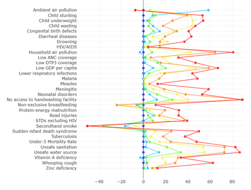
Sustainable Development Goals & k-means clustering Permalink
Challenging historical paradigms with k-means clustering of the United Nations Sustainable Development Goals